
Case Study: Branding and Toy Development
“NON-HEGEMONICALLY MASCULINE MAN” TOY
SKILLS USED: Character Design; Graphic Design; Storyboarding; Motion Graphics; Sound design; Adobe Illustrator; Adobe After Effects.
BRIEF: The video presented above was the promo created at the conclusion of a larger project described below.
In my Fundamentals of Media Design class, we were challenged to design toy packaging with a social statement. Each group worked together to develop project goals, but all design work (illustration, assembly, and animation) was done individually.
Although there have been many positive shifts in female-targeted toys to increase representation for diverse archetypes and identities, my partner and I observed a lack of this change in many male-targeted toys. By taking the aesthetic tropes of “hyper-masculine” toy packaging, and re-contextualizing them to present a healthier alternative to masculinity, we hoped to subvert the constructs of hegemonic masculinity present in many of these toys.
The perpetuation of male targeted action figures that exude a toxic-masculine machismo have consolidated society’s expectation of a ‘manly man’. Representations of hegemonic masculinity are unrealistic, because even though “all boys and men are measured by hegemonic masculinity… most boys and men will never accomplish it” (Myers. 2012). Our vision for the future of toys is one that gives all children a diverse and realistic array of role models by which they can explore identity in a non-restrictive way. In an attempt to create something more realistic and authentic we decided to draw on personal experience, by turning ourselves into “action figures” and celebrating the ways in which we contradict normative masculinity.
ISSUE & OBJECTIVE: Lack of ‘feminine’ or non-macho toys for little boys. Create a figure for boys to realize that sensitivity is an option.
TARGET AUDIENCE: 3-12 year old boys and those still in the process of forming their identity.
PROJECT TONE: Satirical; A juxtaposition of aggressive and sensitive.
MESSAGING: There are alternative role models for young boys. It is ok not to align with hegemonic ideas of masculinity.
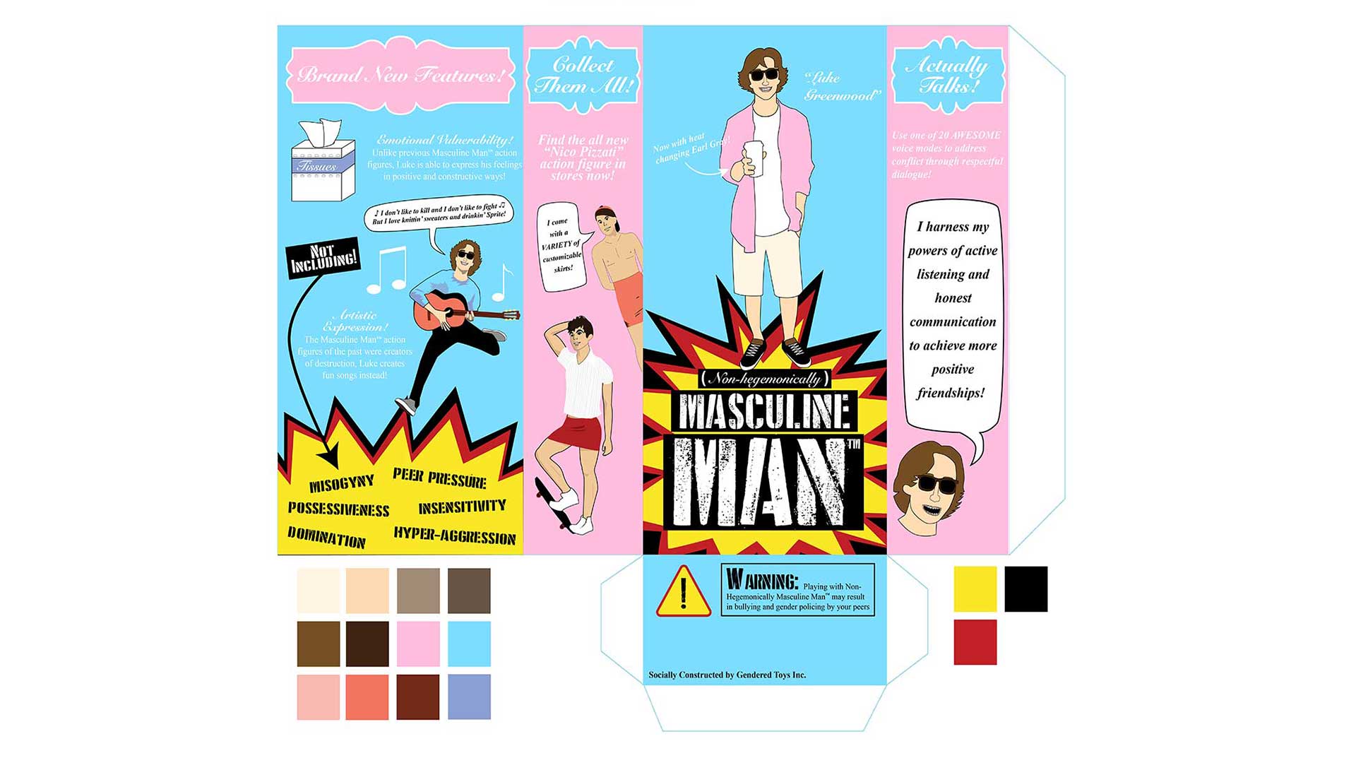
VISUALS: All of our branding images are vector images – personally created in Illustrator.
TYPICAL BRAND ASSETS: Bold typeface. Prominent use of red, blue, black, and white/silver. Stereotypically ‘Masculine’ Imagery – explosions, rugged textures, bold graphics.
Product Box Design
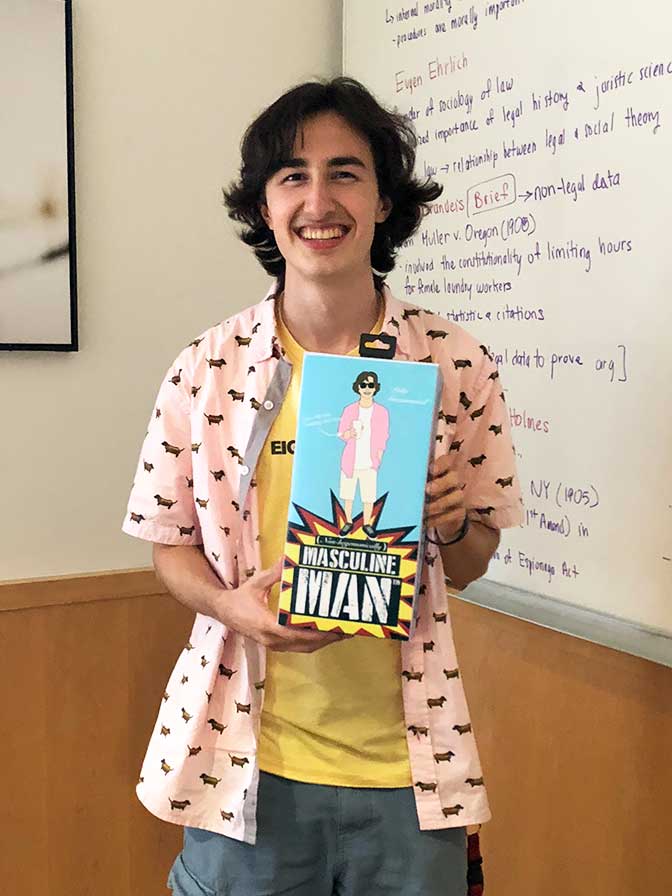
Product Box Build
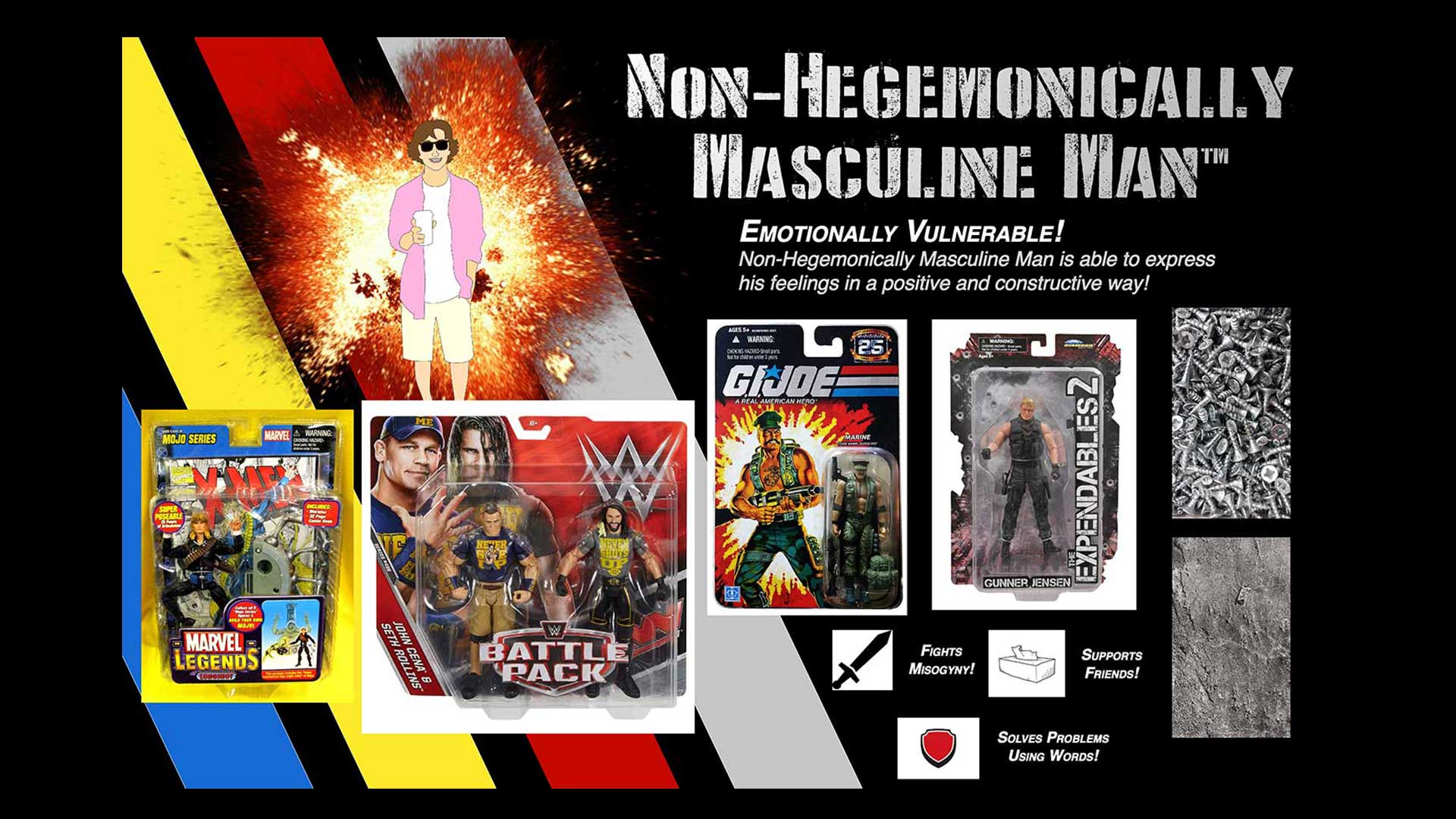
Mood Board – Hegemonic Masculinity
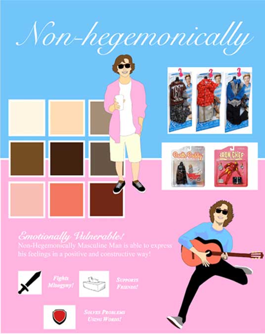
Mood Board – Alternative Masculinity
REFLECTION: “In our ideation process, we observed the countless examples of toys which reinforce violence and domination, and link them to manhood (including G.I. Joe, superhero action figures, WWE wrestler toys, etc.) Our group wanted to illuminate how these toys reinforce hegemonic masculinity, and offer an alternative realistic form of masculinity for young boys to engage with. For the portions of my design which represent the “hegemonically masculine” toys of the past (Masculine Man brand logo, “Not including!”, The warning label) I appropriated the color scheme and bold typography of toys from brands like WWE and G.I. Joe. The decorative font invokes the industrial textures I used for my moodboard and has an aggressive quality. The explosion motif in these portions is borrowed from many “army” toys’ packaging. For the portions of my design which represent my alternative non-hegemonic masculinity I used lighter pastels and a combination of lighter serif and script fonts. The serif/script fonts I chose are more nuanced than the aggressively bold decorative font I used for the “hegemonically masculine” portion, reflecting the more nuanced character I am portraying (an authentic living person, me!). Similarly, I created my own “loopy” brush to add decoration to the tissue box. I balanced blue and pink to show the toy as embodying both traditionally male and female traits. The borders around my headline text is based on logo designs from girl-targeted toys like Disney Princess and La Dee Da Dolls for a similar effect. The bold black, red, and yellow of the “hegemonically masculine” portions of my design are loud, draw the eye, and disrupt the much more visually gentle “non-hegemonically masculine” portion. This is done to argue that the alternative presented by my design is generally more favorable to the past representations of masculinity in toys which often hold toxic messages for young boys.”